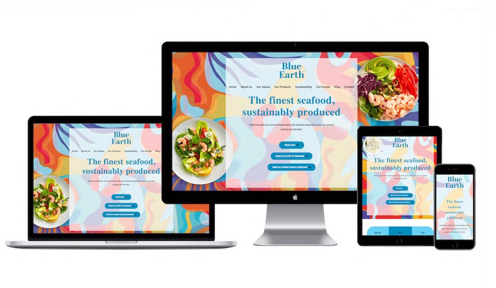
Blueearthfoods.co.uk website

Description
A new company website, with a design as fresh as the sea
The challenge
Blue Earth sources and produces premium seafood products in its role as a leading supplier to major retailers throughout the UK and Europe. As part of a strategic refresh, they needed a new company brand, a fresh new look for their products, and a customer-facing website that was as attractive as their products were delicious.
The solution
By working closely with the Blue Earth team, we created a new brand and product style-guide, which sets Blue Earth apart from its competitors. Through the use of vibrant and customised illustrations, bright new colours, modern crisp typefaces, print-perfect packaging layouts and technical design detail – we created a unique ‘flavour’ for each product in the range. This creative approach then formed the styling for a redesigned and rewritten Blue Earth website. Through a custom-built WordPress design, https://www.blueearthfoods.co.uk tells the Blue Earth company narrative, along with the story behind their people, their purpose, and their products.
The results
By creating a Google Data Studio live dashboard, the Blue Earth team can monitor website performance at a glance and in detail. In the short time the site has been live (a matter of weeks) the site has seen hundreds of sessions and thousands of pageviews from hundreds of users on mobile, tablet and desktop devices.
Categories
- Case Studies
- Digital


